
If we regard space as a beautiful woman, then a carpet is like the presence of blush, a carpet that fits the interior design style can instantly enhance the space’s complexion, making the home radiant. However, if the carpet color is chosen incorrectly, it can also create a glaring or jarring discomfort. Today, the editor shares some carpet color matching secrets from the Tianjiang soft decoration designers with those in need, so they might learn from it.
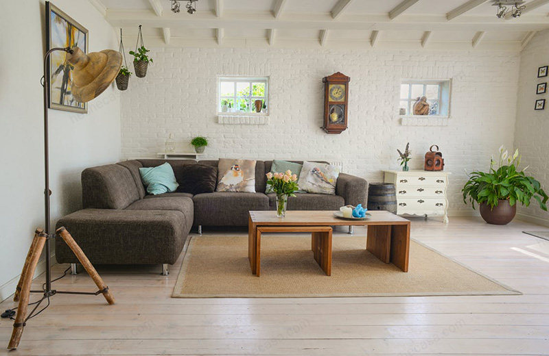
Carpets and walls usually occupy the largest visible area in a room, so their colors should be harmoniously coordinated to achieve the expected decorative effect, such as creating a tranquil and peaceful atmosphere or stimulating and challenging the senses visually. If you want to create an intimate and warm family atmosphere, then warm, dark, and highly saturated carpets should be considered, as these colors evoke a sense of warmth. If your home space is relatively small, it is recommended to consider light-colored carpets, which can make the space appear larger. If your home has good lighting, using cool-toned carpets will make the entire space appear calm and comfortable. Low saturation colors have been very popular in visual design in recent years, with low color purity, so even if users spend a long time with them, they won’t feel too much fatigue. Low saturation color hand-woven carpets are relatively rare because hand-woven carpets originated from nomadic tribes that followed water and grass, and in the vast natural environment, the gorgeous carpets can reduce the monotony brought by the single natural environment. However, low saturation color carpets are very easy to match with modern home decoration. If you want to create a completely tranquil space, then low saturation color carpets are the best choice. A single-tone low saturation space can give a cold feeling, but it is also the most soothing to the soul. And it is very easy to change such a space, just by adding some decorative items with strong color contrast, such as pillows, paintings, and objects, the space can be instantly changed. Unlike low saturation colors, bright and vivid colors can make the entire space充满活力. Therefore, colorful carpets are often the source of warm and hospitable soft decoration colors in a space, and with the soft texture of the carpet, it can bring out the warmth of the entire room to the extreme. If the carpet is the last step in your soft decoration, then at this time, you need to consider whether you want to use the carpet to sublimate the entire space design, supplement, or neutralize. If the interior design is already very perfect, then when choosing the carpet color, you can choose colors that are close to and the same as the interior design. For example, in the selection of living room carpets, the carpet color can be chosen from the colors of the sofa, pillows, walls, curtains, etc. , which is the most common color matching method.If you wish to introduce more colors into your space, you can opt for a rug that contrasts with the existing color scheme. Additionally, incorporate vases, artworks, and ornaments with hues similar to the rug’s color palette to ensure the new colors blend seamlessly with the space. Handmade carpets rarely use a single color over a large area; instead, they typically feature dozens of colors and intricate, rhythmic patterns.
Therefore, handmade rugs, especially Persian ones, are highly versatile. Using a carpet with the same color scheme extensively requires careful consideration of its pairing. The above suggestions provide some ideas and rules for color selection, but they are not absolute. As the saying goes, rules are made to be broken. Thus, the choice of carpet color, like the size, should be determined by the homeowner for their comfort, as life is ultimately one’s own and unrelated to others.